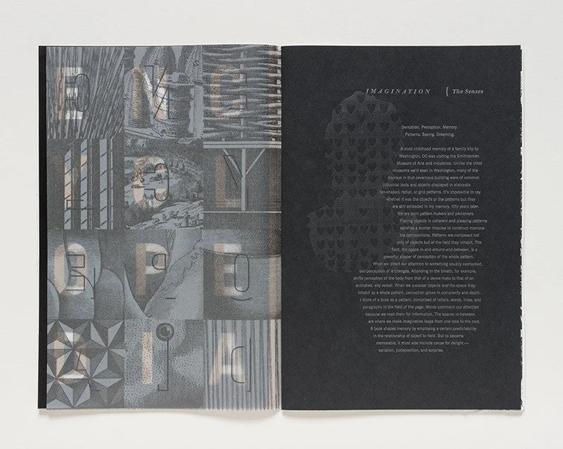
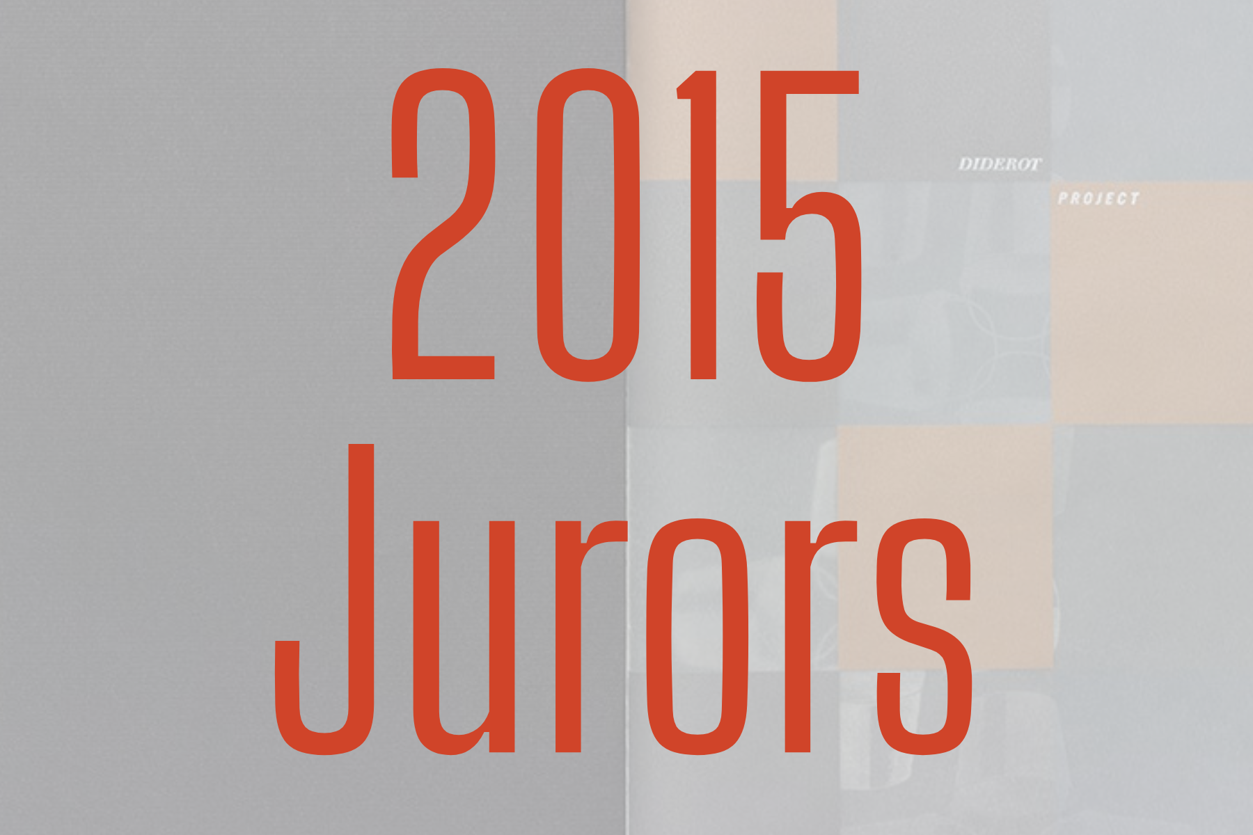
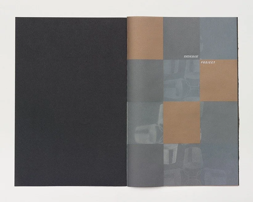
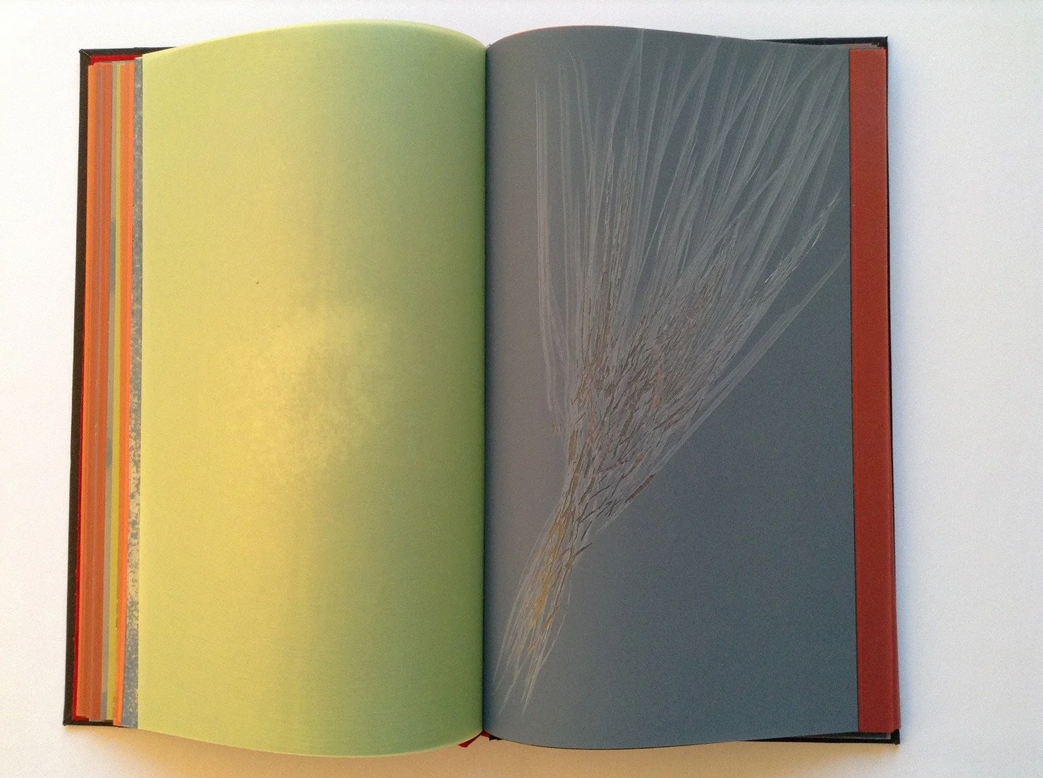
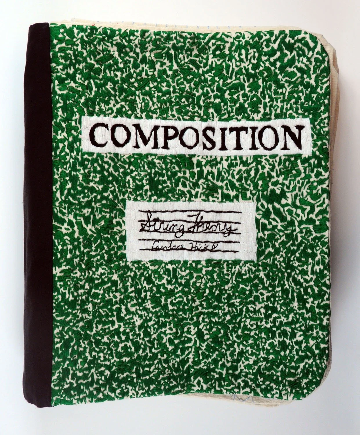
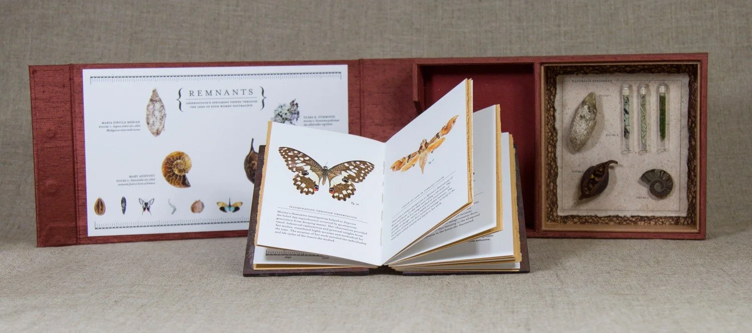
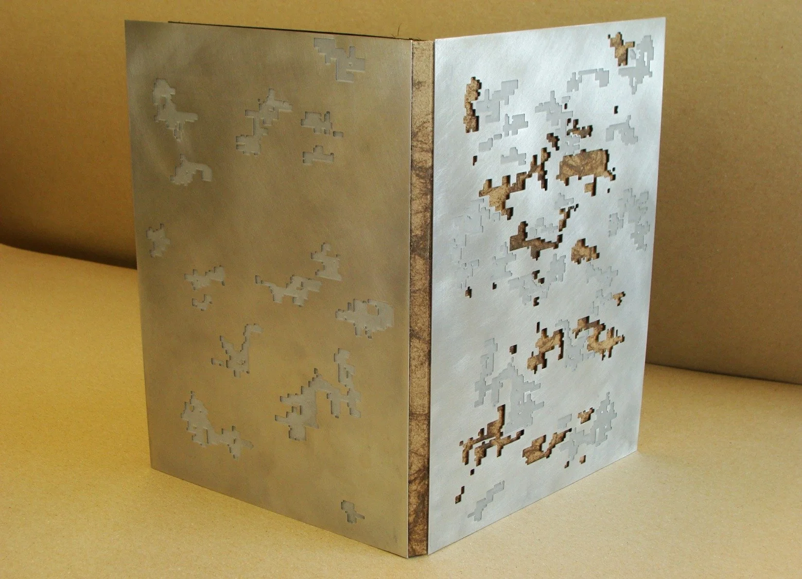
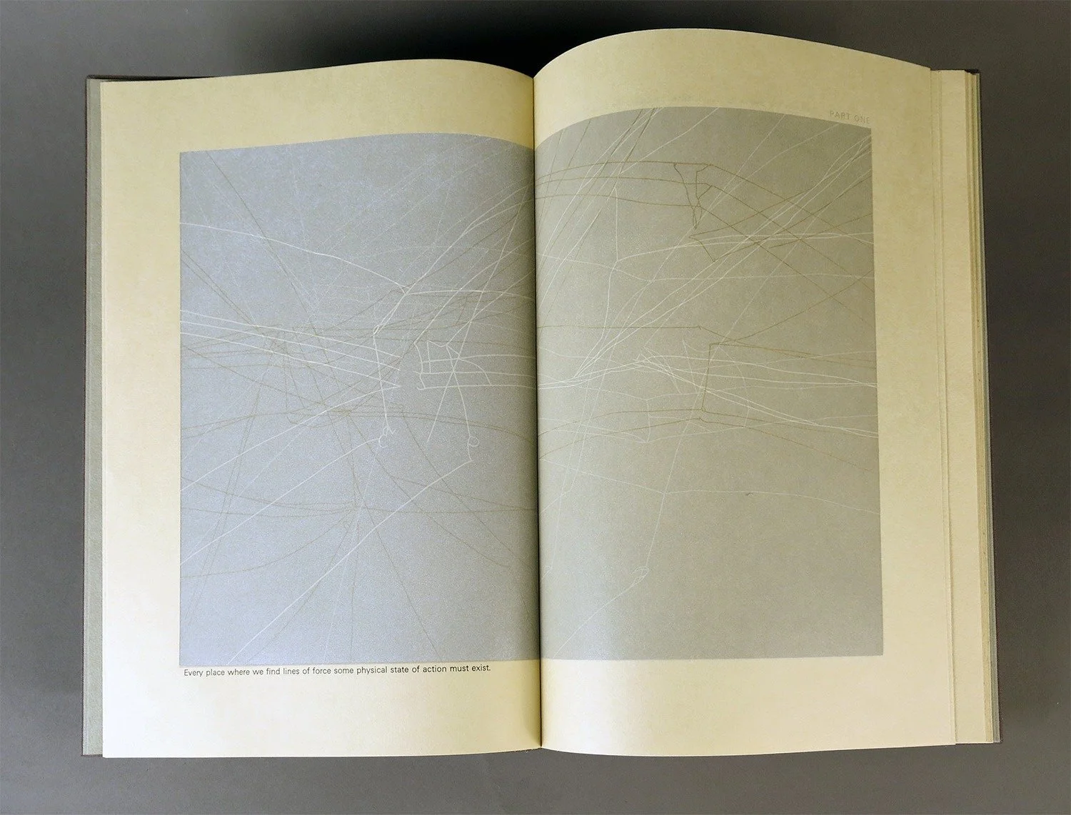
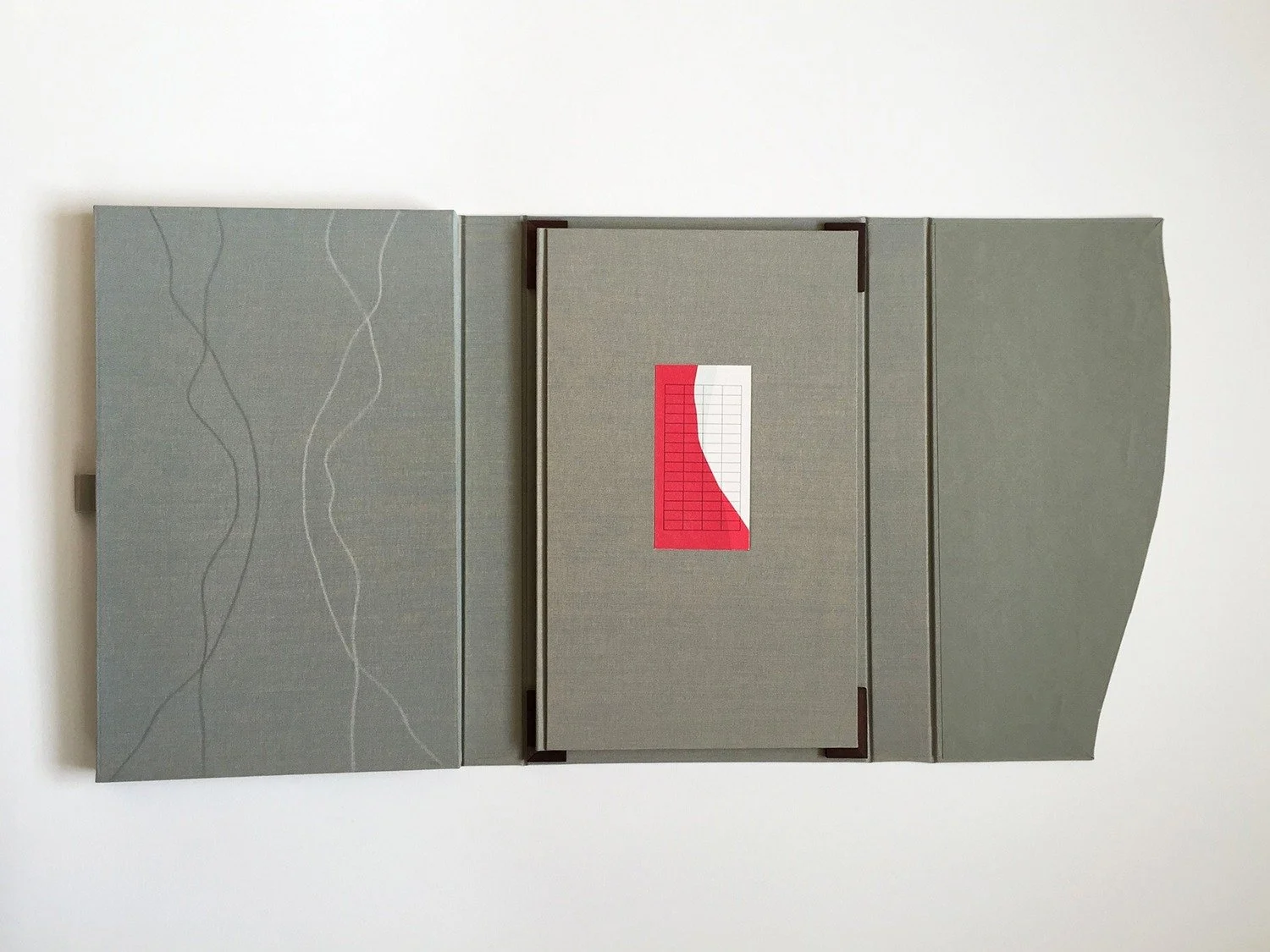
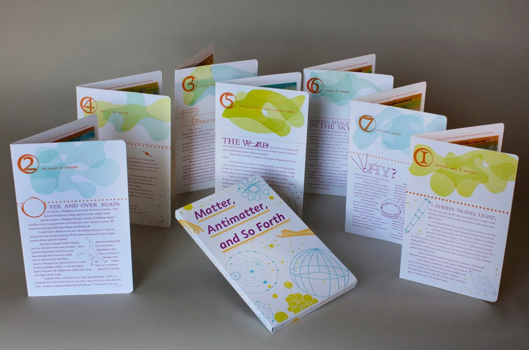
Ken Botnick, “Diderot Project”

Botnick_1
Half-title printed in 5 colors on UV Ultra paper. Colors blocks were printed on the verso of this sheet which is why the gold and silver have a matte or muted tone. Silver half title is printed on the reader’s side of the sheet. Show-through to following page and print of buckets is visible through the color blocks.

Botnick_2
Part of the title sequence. The silver “Project” is printed on this side of the sheet to align perfectly with “Diderot” on the verso. Composition of this page considers the composition on the previous two pages showing through the paper to make a composite composition with the page turn.

Botnick_3
Another aspect of the titling sequence playing with the visual quality of the name, Diderot, and the structural quality of the type face, Walbaum. The type you are seeing on the left is the result of seeing 4 paper surfaces aligned to create the image of a machine. The illustration on the right hand page is printed in silver on black paper. The circle is a repeating visual metaphor in the book.

Botnick_4
There are three sections in the book and each has its own typographic ‘signature’ established at the beginning of the section with an introductory passage I wrote. This is the opening section on The Object, the typography evoking the angular quality of the tool or machine. The quote on left page is by Goethe and the image is a composite of a plate on the section on fishing and a sky filled with figure numbers that appear throughout the Encyclopedia plates. There are a total of 40 different authors of texts, mostly short, in the book, but the largest amount of texts are by Diderot and myself.

Botnick_5
This page spread introduces the section on The Senses. The left hand page is a composite of two different typographic constructions of the word Encyclopedia that appear regularly throughout the book to announce a change in content. The left page is UV Ultra printed on two sides with a mosaic grid of fragments of Encyclopedia plates printed in silver +transparent. On the verso is a fragmented version of the Encyclopedia grid construct in black. The previous page shows through in black and gold. The right hand page has another introductory passage about the coming section written by me. The silhouette is Diderot’s portrait bust by Houdon with one of the plates used to evoke Diderot’s changing nature as he edited the Encyclopedia.


Ken Botnick (St Louis, Missouri)
kenbotnick.com

Diderot Project
2015
Letterpress printing and handmade paper
Edition Size: 70
Pages: 150
Dimensions open: 11.25 x 14.5
Dimensions closed: 11.25 x 7.25

I believe we make books in order to discover our subjects.

This project is the result of a 5-year investigation of the Encyclopédie, ou dictionnaire raisonné des sciences, des arts et des métiers of Diderot and d’Alembert. It is a 150-page visual and textual narrative (meditation) on several subjects I highlighted in the Encyclopédie, namely, the nature of craft, the hand, work, tools, machines, dreams, the senses and the imagination. There are six different papers in the book, including three specially watermarked sheets I designed for the edition and made at Dieu Donne paper in New York. Over 220 press runs and 8 pounds of inks were used in the production of this book.

This is not a book about the Encyclopédie. It might, more accurately, be described as a book of, or with, or even because of the Encyclopédie. While it began primarily as a visual exploration of the original plate volumes seen through the lens of the camera, it grew by considering the encyclopedia as a system of correlations and leaps of the imagination, which was Diderot’s intent for the readers of the Encyclopédie.

In my books I strive for a balance of three components: conceptual organization; visual metaphor; formal execution.

Conceptual Organization
The structure is based upon the organization of the Encyclopédie as explained in the Detailed System of Human Knowledge. Three uber categories, Memory, Reason, and Imagination, are used to categorize all entries. For this book I have maintained the structure of three, but with new headings based on my readings of the images and what they inspired. They are the Hand, the Object, and the Senses. A narrative is woven of images overlaid with texts from Diderot’s original encyclopedia entries and those of 40 other writers; Lewis Mumford, Michel Foucault, Gaston Bachelard, Roland Barthes, Goethe, Francis Ponge, Gary Snyder, contemporary neuroscientists, philosophers, architects, and the designer/author of this edition, Ken Botnick. The two major voices in the book are Diderot’s and mine.

Visual Metaphor
Transparency is the central metaphor of this book, in inks, papers, and watermarks. This is, primarily, a visual reference to Diderot’s call for more transparency in society. But it is also employed as a visual representation of memory and the way it accumulates in layers and fragments. There are several sequences in the book where the image one is reading is composed of printing on 4 or 5 surfaces of paper. Pattern is a strong visual component of the book, referencing cognition and memory (as well as being extremely fun to play with.) Finally, the negative, or white space, of the pages is an allusion to a synaptic space, the connective tissue of the system, where leaps of the imagination occur.

Formal Execution
Encyclopédie images form the core of the book but the design is driven by a marriage of word and image. Though the type is shaped, it is rarely perceived as a shape so much as it is seen as defining the negative spaces of the page. There is a typographic signature for each section. The first section on the Hand has typography with softly curving edges reflecting the nature of material shaped in the hand. The second section, the Object, has the sharp, angular shapes carved by a tool. And the final section, the Senses, presents subtle challenges to the expectation of the reading experience.

2015 MCBA Prize Winner Announcement

As part of our 30th Anniversary celebration, Minnesota Center for Book Arts (MCBA) is proud to announce that the winner of the 2015 MCBA Prize is Ken Botnick, for his artist’s book, Diderot Project

“I believe we make books in order to discover our subjects,” Botnick remarks in his artist statement for the winning work. Diderot Project was inspired by a five-year-long investigation of the “Encyclopédie ou dictionnaire raisonné des sciences, des arts et des métiers” — a 150-page visual and textual narrative; a meditation on the nature of craft, the hand, work, tools, machines, dreams, the senses and the imagination. The book is letterpress printed in five colors and incorporates six different papers, including handmade and watermarked paper made by Botnick at Dieu Donne paper studio in New York.

Botnick’s content began primarily as a visual exploration of the original plate volumes seen through the lens of the camera, then grew by considering the encyclopedia as a system of correlations and leaps of the imagination, incorporating original narrative by Botnick and excerpted texts by some 40 other authors. To see images of the work and read more by the artist describing his process in making the book, visit his entry page at MCBAPrize.org.

This year’s competition, celebrated in coordination with MCBA’s 30th Anniversary, was judged by a jury of three experts in the field of book arts. The jurors reviewed a total of 170 submissions, representing 18 nations around the world from five continents, including 34 of the 50 United States. View the entire MCBA Prize 2015 online gallery at MCBAPrize.org.

Finalists for the 2015 MCBA Prize included:
– Sarah Bryant and David Allen, Figure Study
– Casey Gardner, Matter, Antimatter, and So Forth
– Sara Langworthy, On Physical Lines
– Robin Price, Love in the Time of War

The jury also awarded three Special Recognitions of Merit:
– Rhiannon Alpers, Remnants
– Candace Hicks, String Theory, Vol. III
– Gabriella Solti, The Book of Hours

The winner was announced at MCBA’s 30th Anniversary Gala and award ceremony on Saturday, July 25. The winner receives a total cash prize of $2,500, plus an additional $750 travel stipend to attend Book Art Biennial and The MCBA Prize gala and award ceremony. Finalists each receive a $500 cash award and $750 travel stipend.

The MCBA Prize 2015 jury consisted of:
– Aaron Cohick, proprietor of NewLights Press and master printer at The Press at Colorado College
– Daniel E. Kelm, book artist and founder of the Garage Annex School for Book Arts
– Jae Jennifer Rossman, Assistant Director for Special Collections, Yale University Library
(For complete bios, visit our Jurors page.)

In summing up the first stage of the competition, the jury stated:
“The MCBA Prize 2015 attracted work of impressive depth and quality. The selection process to name five finalists from the pool of 170 submissions compelled an active discussion on topics such as integrity, finish, physicality, complexity, and the development of ideas. We found our discussions thought-provoking, yet fun, as we anticipated the next missive from our colleagues. Eventually, the difficult decisions were made, but not before each juror passionately articulated their opinions. We are looking forward to continuing the discussion at MCBA’s Book Art Biennial and beyond. Thank you to all who entered for sharing your work with us, and congratulations to the finalists.”

The MCBA Prize was founded in 2009 as the first honor to recognize book art from across the field and around the world. The award is presented in conjunction with Book Art Biennial, a series of workshops, exhibitions, presentations and performances that inspire discussion and explore contemporary practice in the book arts. The fourth Biennial Symposium, convened July 23-26, 2015, continues a tradition of stimulating critical thinking and dialogue. For more details on Book Art Biennial and MCBA’s educational and artistic programming, visit MNBookArts.org.