
Half-title printed in 5 colors on UV Ultra paper. Colors blocks were printed on the verso of this sheet which is why the gold and silver have a matte or muted tone. Silver half title is printed on the reader’s side of the sheet. Show-through to following page and print of buckets is visible through the color blocks.

Part of the title sequence. The silver “Project” is printed on this side of the sheet to align perfectly with “Diderot” on the verso. Composition of this page considers the composition on the previous two pages showing through the paper to make a composite composition with the page turn.

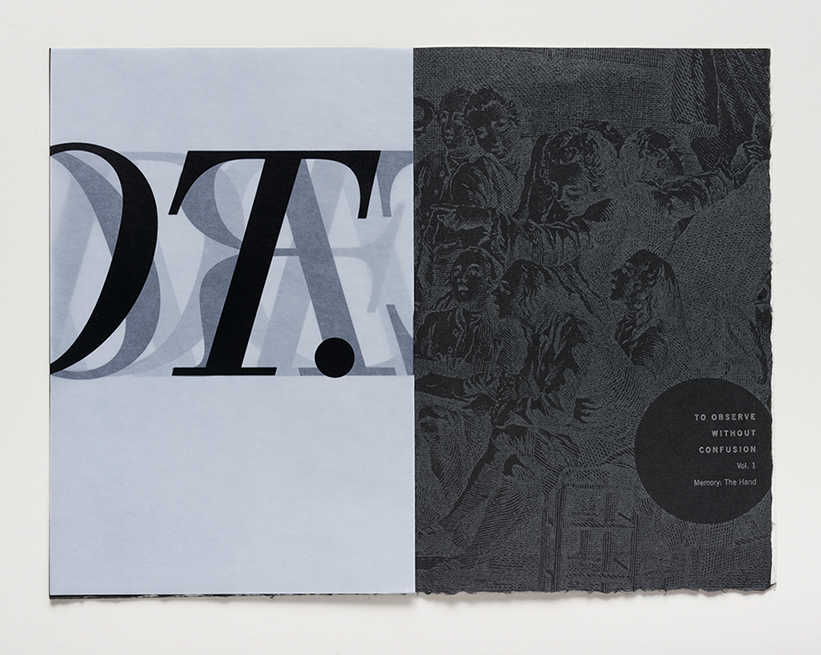
Another aspect of the titling sequence playing with the visual quality of the name, Diderot, and the structural quality of the type face, Walbaum. The type you are seeing on the left is the result of seeing 4 paper surfaces aligned to create the image of a machine. The illustration on the right hand page is printed in silver on black paper. The circle is a repeating visual metaphor in the book.

There are three sections in the book and each has its own typographic ‘signature’ established at the beginning of the section with an introductory passage I wrote. This is the opening section on The Object, the typography evoking the angular quality of the tool or machine. The quote on left page is by Goethe and the image is a composite of a plate on the section on fishing and a sky filled with figure numbers that appear throughout the Encyclopedia plates. There are a total of 40 different authors of texts, mostly short, in the book, but the largest amount of texts are by Diderot and myself.

This page spread introduces the section on The Senses. The left hand page is a composite of two different typographic constructions of the word Encyclopedia that appear regularly throughout the book to announce a change in content. The left page is UV Ultra printed on two sides with a mosaic grid of fragments of Encyclopedia plates printed in silver +transparent. On the verso is a fragmented version of the Encyclopedia grid construct in black. The previous page shows through in black and gold. The right hand page has another introductory passage about the coming section written by me. The silhouette is Diderot’s portrait bust by Houdon with one of the plates used to evoke Diderot’s changing nature as he edited the Encyclopedia.
Ken Botnick (St Louis, Missouri)
kenbotnick.com
Diderot Project
2015
Letterpress printing and handmade paper
Edition Size: 70
Pages: 150
Dimensions open: 11.25 x 14.5
Dimensions closed: 11.25 x 7.25
I believe we make books in order to discover our subjects.
This project is the result of a 5-year investigation of the Encyclopédie, ou dictionnaire raisonné des sciences, des arts et des métiers of Diderot and d’Alembert. It is a 150-page visual and textual narrative (meditation) on several subjects I highlighted in the Encyclopédie, namely, the nature of craft, the hand, work, tools, machines, dreams, the senses and the imagination. There are six different papers in the book, including three specially watermarked sheets I designed for the edition and made at Dieu Donne paper in New York. Over 220 press runs and 8 pounds of inks were used in the production of this book.
This is not a book about the Encyclopédie. It might, more accurately, be described as a book of, or with, or even because of the Encyclopédie. While it began primarily as a visual exploration of the original plate volumes seen through the lens of the camera, it grew by considering the encyclopedia as a system of correlations and leaps of the imagination, which was Diderot’s intent for the readers of the Encyclopédie.
In my books I strive for a balance of three components: conceptual organization; visual metaphor; formal execution.
Conceptual Organization
The structure is based upon the organization of the Encyclopédie as explained in the Detailed System of Human Knowledge. Three uber categories, Memory, Reason, and Imagination, are used to categorize all entries. For this book I have maintained the structure of three, but with new headings based on my readings of the images and what they inspired. They are the Hand, the Object, and the Senses. A narrative is woven of images overlaid with texts from Diderot’s original encyclopedia entries and those of 40 other writers; Lewis Mumford, Michel Foucault, Gaston Bachelard, Roland Barthes, Goethe, Francis Ponge, Gary Snyder, contemporary neuroscientists, philosophers, architects, and the designer/author of this edition, Ken Botnick. The two major voices in the book are Diderot’s and mine.
Visual Metaphor
Transparency is the central metaphor of this book, in inks, papers, and watermarks. This is, primarily, a visual reference to Diderot’s call for more transparency in society. But it is also employed as a visual representation of memory and the way it accumulates in layers and fragments. There are several sequences in the book where the image one is reading is composed of printing on 4 or 5 surfaces of paper. Pattern is a strong visual component of the book, referencing cognition and memory (as well as being extremely fun to play with.) Finally, the negative, or white space, of the pages is an allusion to a synaptic space, the connective tissue of the system, where leaps of the imagination occur.
Formal Execution
Encyclopédie images form the core of the book but the design is driven by a marriage of word and image. Though the type is shaped, it is rarely perceived as a shape so much as it is seen as defining the negative spaces of the page. There is a typographic signature for each section. The first section on the Hand has typography with softly curving edges reflecting the nature of material shaped in the hand. The second section, the Object, has the sharp, angular shapes carved by a tool. And the final section, the Senses, presents subtle challenges to the expectation of the reading experience.