


Aaron Cohick (thepressatcoloradocollege.org)
Divya Victor (divyavictor.com)
Colorado Springs, Colorado
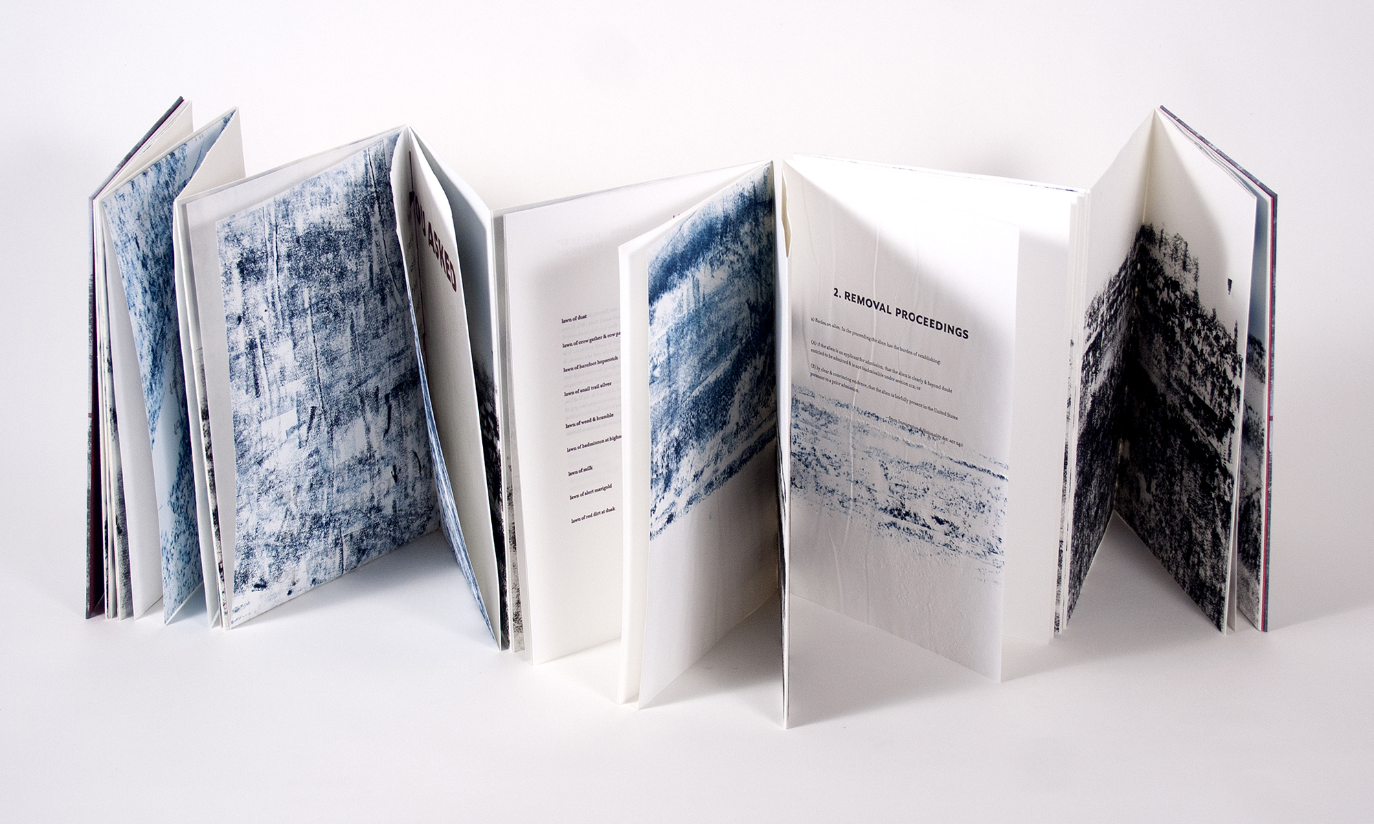
CURB
2019
accordion book with sewn-in sections. Letterpress from photopolymer and rubbings.
12.5 x 8 x 3″ closed, accordion extends to about 13′
Artist Statement
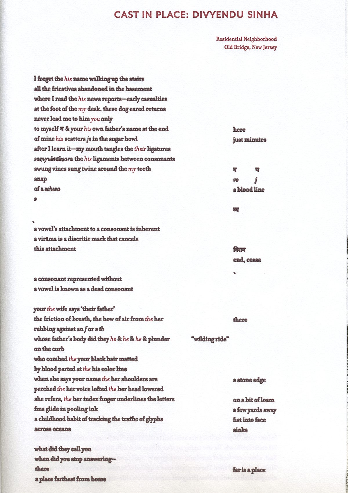
CURB is a collaborative fine press/artists’ book, written by Divya Victor and designed and printed by Aaron Cohick. CURB comes from the convergence between documentary poetics and the possibilities of structure and legibility in the handmade book. The text is a series of poems that document the assaults and murders of Indian-Americans and Indian immigrants in public spaces in the United States. Its unifying non/site is the curb and sidewalk, and its central image is a body falling to the concrete.
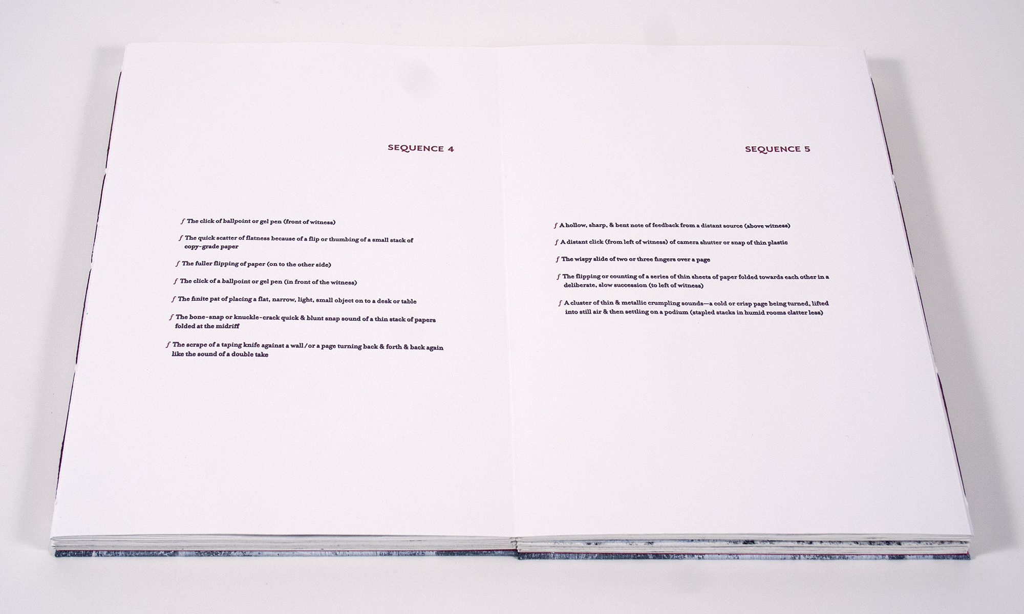
The third section of the poems is called “Frequency.” A note towards the end of the section reads:
Three years after the death of her husband Divyendu Sinha, Alka Sinha appeared at a courthouse in New Brunswick to offer testimony in response to the Court’s lenient sentencing of the men who were responsible for his death. She began her testimony by playing a recording of Divyendu’s voice-mail greeting. She closed it by walking away from the podium. His recorded voice & her living voice were buried together in a soundscape of this courtroom. The duration of her entire testimony, documented in these ten sequences, was 8 minutes.
The main text of “Frequency” is a transcription of the silences in Alka Sinha’s testimony. In our early conversations about what the book could be Divya described “Frequency” as the “rhizomatic spine” of the book. The paradox of that idea became the generative seed of the form—a spine that is itself a network or diaspora, producing multiple entry points into, and paths through, the text. That concept is actualized in the physical structure of the book— “Frequency” is one side of a double-sided accordion, and the rest of the text emerges from its reverse as smaller sections and fold-outs. The fold-outs reference the opening of a map, putting the reader in the position of announcing their reading in the same way that a traveller or immigrant announces their foreignness by opening a map in a public space. The fold-outs and text sections are woven through a fractured horizon made from rubbings of sidewalks and curbs.
The printing forked into three paths: direct rubbings that imprinted the pages with a textural trace of concrete; a traditional, carefully crafted approach to typography and letterpress printing; and a complete reversal of that tradition through repetitive overprinting. The text of the poems was overprinted 12 times—once for each of the people that the book is dedicated to—transforming the act of printing into a mourning/meditation that manifests as an excess and literal blurring of the text. The complete book incorporates color, gesture, tactility, and embodied space into the reading of the text.