

R. J. Kern
Minneapolis, Minnesota
rjkern.com
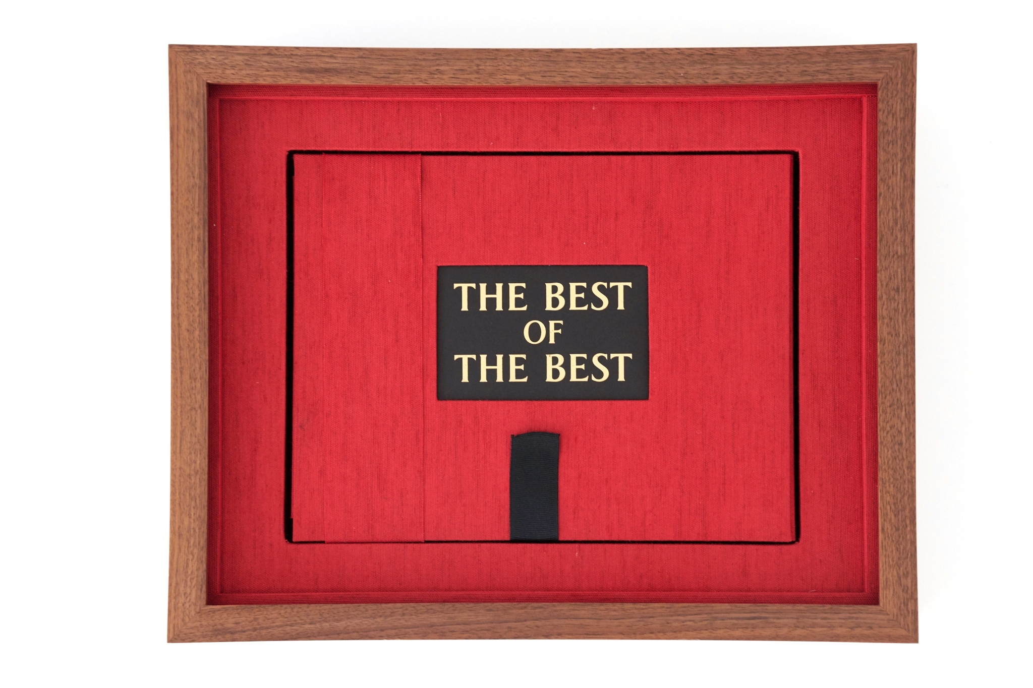
The Best of the Best
2020
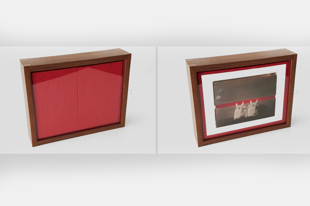
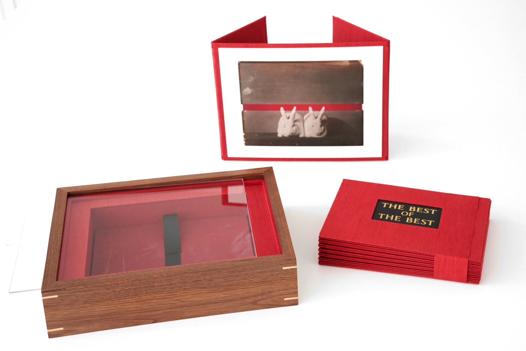
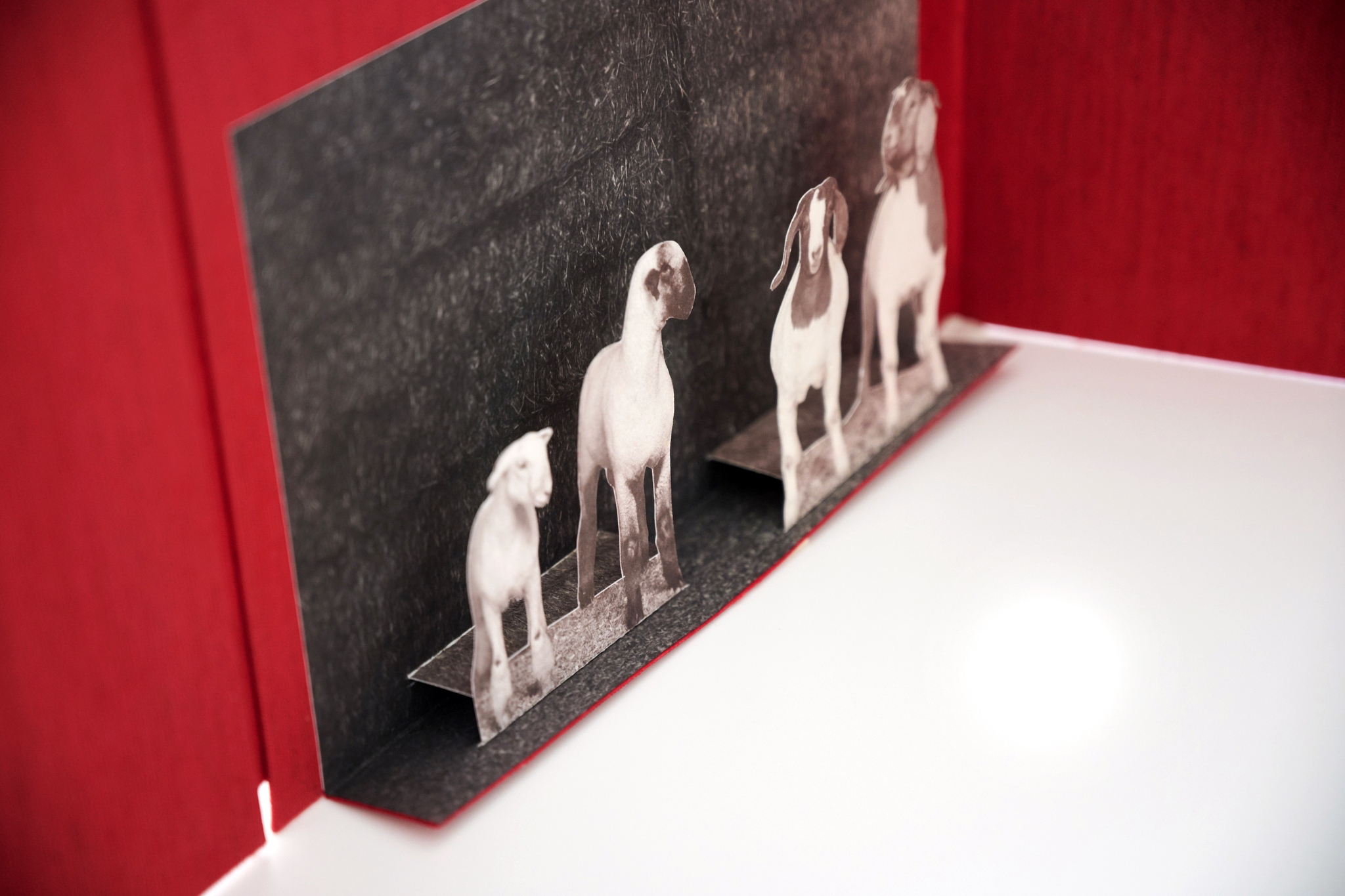
From its 11 x 14 x 3 inch box, the accordion-fold book unfolds into a sequence of photographs and three-dimensional pop-ups. The book includes twelve bound salt prints gold-toned along with four pop-up salt prints with salt print backgrounds, waxed with white beeswax and lavender oil. The print folio includes one freestanding salt-over-archival pigment print signed by R. J. Kern; each of these prints is a unique animal pair drawn from an edition of 10. The salt prints were printed and gold-toned by the artist on Fabriano Bristol+ (250 gsm) paper, waxed with white beeswax and lavender oil. The pop-up elements were constructed and hand-cut by Kyle Olmon with the application of a pH-neutral archival polyvinyl acetate (PVA) glue. Keith Taylor created the book binding, book cradle, and print folio. Each of the pages was made with book board, bound using archival materials and processes. The Dragon EF font by Elsner + Flake was used in the embossing and text. The red canvas backdrop used in the photographic project was painted by Sarah Oliphant using acrylic on canvas prepared with gesso. A cut segment from this canvas appears in the book cradle of the wooden box. Jeff Berg built the walnut and maple spline presentation box and prepared the UV-protecting acrylic glazing with pull tab.
Contents fit inside 11 x 14 x 3″ box. If exhibited in a rectangle form, dimensions are 41.25 x 31″. Accordion pages (15) open to 12.6′.
Artist Statement
The Best of the Best records champion animals at the 2018 Minnesota State Fair, one of the most competitive animal contests in the world. Animal breeding, like photography, is an arena of technical and material evolution. This series explores the relationship between the present and the past, drawing parallels between early animal contests at agricultural fairs and the first major exhibition of photography at the 1851 World’s Fair in London.
This project documents an event in which 12 pairs of animal species are judged supreme champion— the best of the best. Using a digital camera, the winning exemplars of domesticated animals are photographed then combined with 19th-century salt printing techniques and contemporary inkjet technology into images that emphasize changes in breeds over time and advances in photographic technology. It is science and art; it renders both an objective typology of animal husbandry and commentary on animal contests at this time and place. The hand-crafted portraits reference similarities between the history and development of photography and the advent of animal contests.
As with life, animal breeding, and photography, the contributions of chance remind us that we are not in control. Two champions do not guarantee champion offspring. The unforeseen result of science and chance can be the embodiment of beauty or success. When several animals meet and exceed the standards that judges rely on to guide their decisions, the winner becomes a subjective choice.
The color red is a unifying element and a nod to French photographer Nadar (Gaspard-Félix Tournachon, 1820–1910), who used the color in marketing his work. Historically, the color red has represented life, health, and victory. It also symbolizes a shared characteristic between the animals: the color of blood, whose principal ingredient is salt— an essential element for mammals and birds.
Salt prints, a photographic process popular between 1839-1860, connect to photography’s historical roots; printing on them digitally connects to the present. Combining these two printing processes softens photography’s particularized quality. The subtle tones of salt printing express mood and emotion, a contrast to the sharpness of a digital print. Subject, process, emotion, science, and chance combine to make both an immediate document and a comment on photography’s past, present, and future.