


Tim Hopkins
London, United Kingdom
thehalfpintpress.wordpress.com
“Imaginary Letters” by Mary Butts
2019
letterpress on various papers
9.75 x 4.75 x 1.25″
Artist Statement
Imaginary Letters by Mary Butts; the Half Pint Press Edition
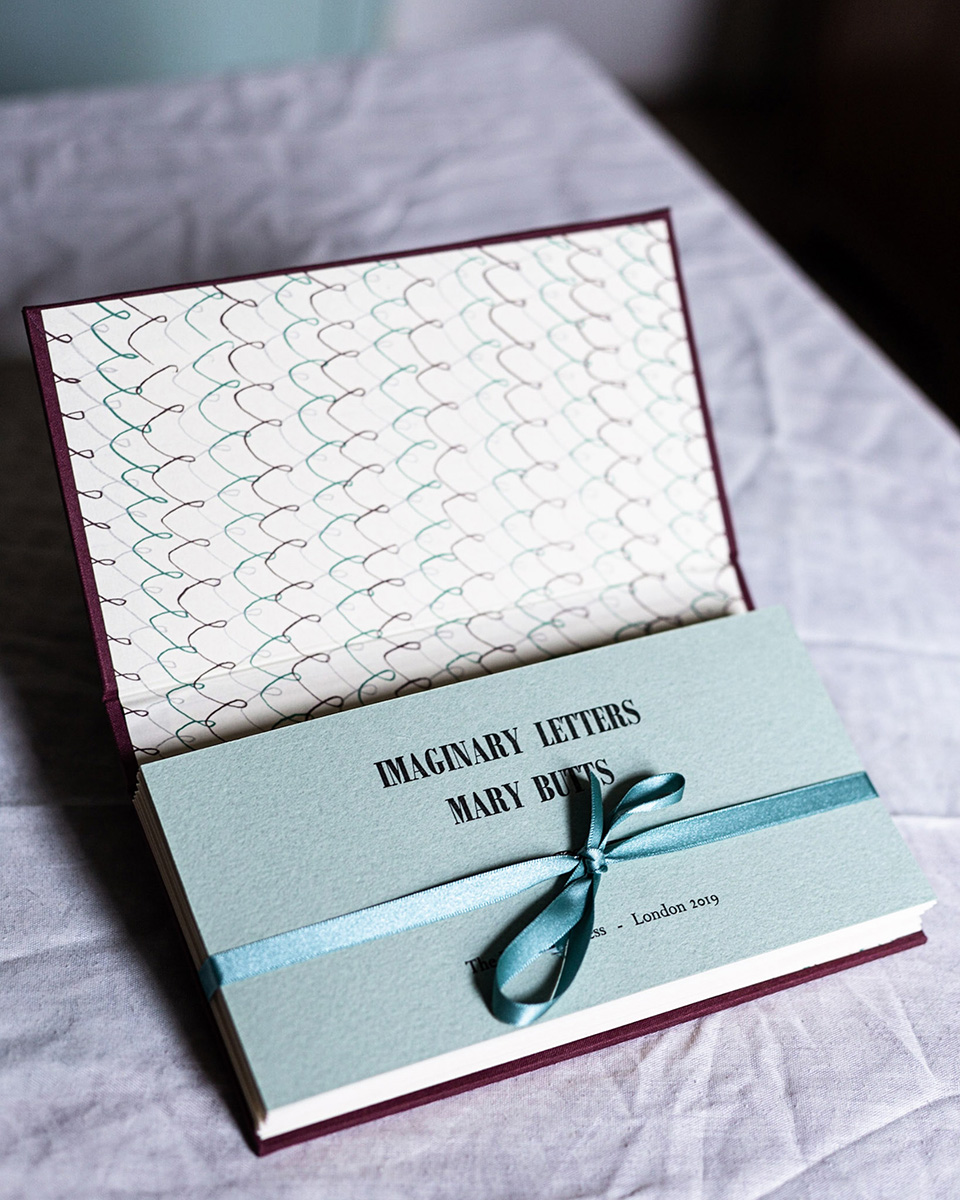
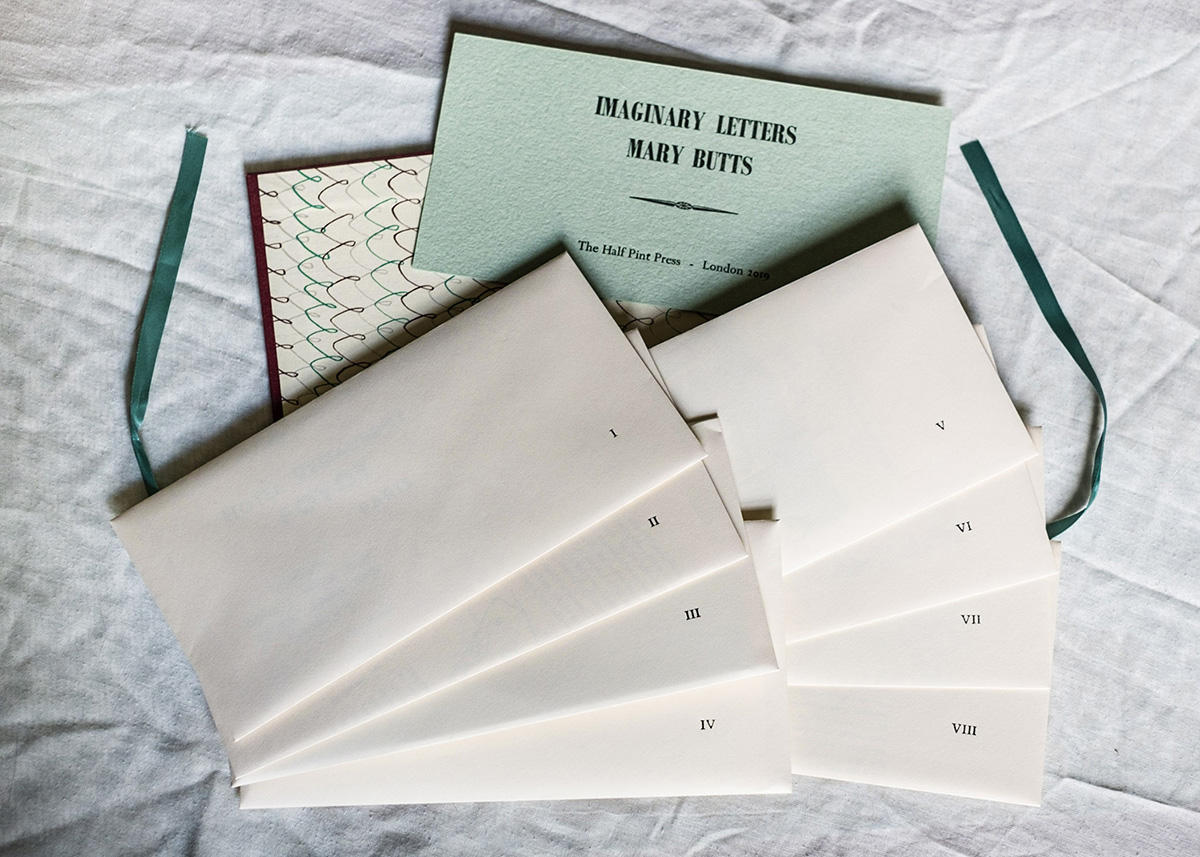
Mary Butts’s 1928 novella Imaginary Letters comprises eight letters. This edition of the novella appears at first to be a cloth-covered hardback book but once opened shows eight envelopes tied with a ribbon bound into the casing. Each envelope holds one of the letters. The envelopes are uniform but the contents are very different. The edition of 100 was typeset by hand and printed by hand by Tim Hopkins at the Half Pint Press, on an “Adana eight-five” tabletop letterpress.
The idea was to take an existing novella and present it in a way to make the reading experience richer and more atmospheric by making the physical form of the book match and enhance the textual content.
Mary Butts (1890-1937) was an English modernist who published several novels and short stories. These “Imaginary Letters” are addressed by the unnamed narrator to the imagined mother of Boris Polterasky, a White Russian exile living a bohemian life in Paris. The narrator loves Boris but it quickly becomes clear that Boris’s interest lies elsewhere.
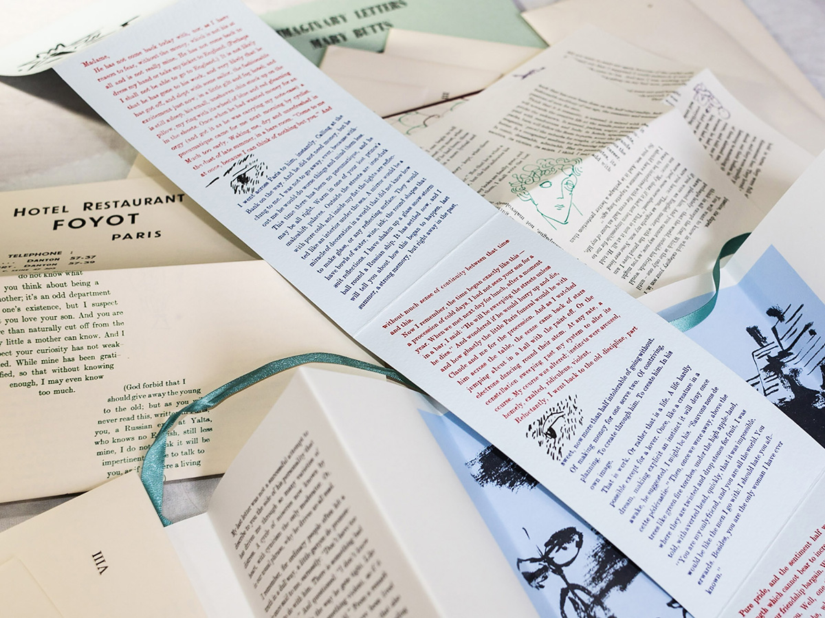
Each letter in this edition looks and feels very different; the physical form of each reflects the developing mood of the novel, initially exuberant, then confused, delicate and fragile, and finally sombre. Lupe Núñez’s decorations, which were commissioned with the brief of producing “modernist marginalia” also subtly track these shifting moods. Some of the letters are on multiple sheets of good paper; others on single sheets that fold in various ways to fit their envelope; one letter has each paragraph numbered and printed separately on many different papers, including postcards and photographs, which are held loose and disordered inside their envelope. One letter is printed on old ledger paper, another on tissue so thin that the reader’s hand is visible through the text.
The entire edition was printed on the Adana letterpress (with the exception of the large illustration in letter IV, which was screen printed). The “hardback” case was also hand-made, with endpapers specially screen-printed by Jenn Phillips-Bacher.
The text is in the formal Modern Number 1 type – there is no suggestion that these are “real” letters written in longhand, which would risk feeling twee or contrived. Nevertheless, the imperfections that result from printing large amounts of text on a small tabletop press (indentations in the paper, some inconsistencies in the printing) are unmistakably the product of a human hand, which further adds to the atmosphere of reading a real person’s letters.
The core of the edition remains the original text – the book is for reading – but the reading experience is very different from the novel as originally published. The reading is slowed – the physical fact of opening and replacing letters means you can’t read it too quickly, and the changing presentation emphasises the time that has elapsed between each letter in the story. It is also deepened through the sense of handling the artefacts that tell the story. The form and presentation of the book work together with the century-old words to form a coherent and fascinating whole.